Logo & Branding
Mandy Thandi Studio
A glimpse of Mandy's organic and yet contemporary approach to her style of original art & prints collections.


So & Co Building Services
It's 'S' shape reflects both a visual image of a well-built house and its strong foundations. Its typeface—strong and bold—making a stamped trademark of trustworthiness in their company.
Sow Space
The icon follows a number of concepts that align with their ethos. Regenerative design is embodied within the infinity symbol that is the letter ‘S’. The triple bottom line (of sustainability) is a Venn diagram, representing the idea that a balance of all elements results in the best and most well-rounded solution.

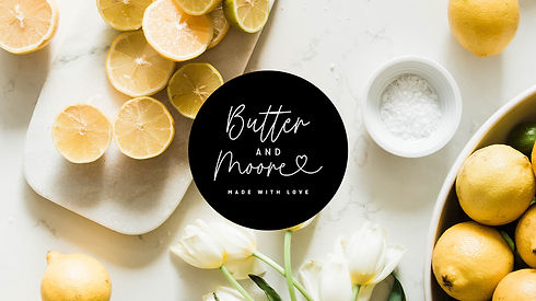
Butter & Moore
Butter and Moore, a food catering business, that delivers fresh and tasty food to your door. These delicious treats are the star of the show, so a fuss-free simple monotone logo pairs perfectly against it.
Lew & Ri
Home is where the heart is, and out of that births Lew & Ri, a small business selling handmade with love designs.


Trina Tan Interiors
Trendy yet timeless interior designs that would suit you to a tee. Trina Tan Interiors prides herself in creating spaces that you'll be proud of. Step into the world of potential.